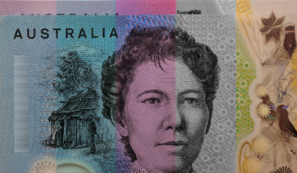
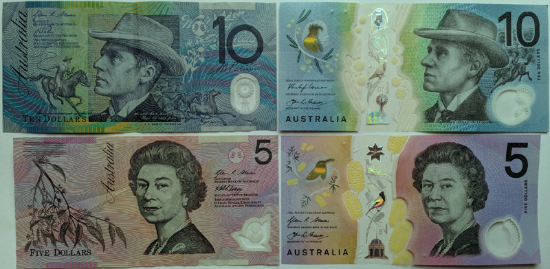
 Until the release of the new $10 note a few months ago, I'd never really thought about the colour of banknotes. I guess all the countries I've visited (except the USA) have had adequately different notes. But Australia's new note tore up my complacency, as I discovered that I couldn't tell it apart from the newish $5 note unless looking at the actual images and numbers on it.
A lot of thought apparently goes into the design of new banknotes, and I don't just mean the images thereon. Modern banknotes are covered with security features, from holograms to windows to microprint to fluorescing bits, and more. They're made of special papers of plastics. They often have intricate, hard-to-forge visual designs.
Supposedly, thought goes into making the notes easy to use for people without normal vision. Most obviously, this means differentiating them by size (US notes are famously all the same size and colour, which is particularly unfun), and perhaps adding braille or at least a few raised dots (which Australia's new notes have).

I have moderate-strong red-green colour-blindness, and the two new notes have been designed with seemingly no regard to the needs of red-green colour-blind users (about 8% of the male population, to varying degrees), despite the Reserve Bank claiming that they understand the importance of colour contrasts, and having clearly illustrated its significance in an article about the earlier series of poymer notes. This is what a colour-blind person might see, approximately, depending on whether they have a red or green deficit.


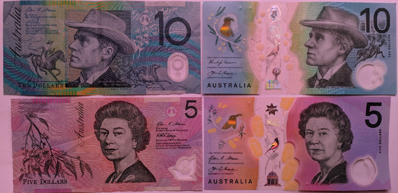
I simply cannot tell which new note (on the right) someone is handing me without seeing most of each note. That's not how people manage money usually. We rely on quickly recognisable small features in a smooth physical transaction (i.e. notes handed to you, overlapping, and quickly transferred to your wallet or purse). And when we look in our wallet to take out a note, we rely on the edges of the notes. Below is a simulation of what a red-weak person has to deal with.

Normal-vision people sometimes dismissively say "just look at the number", or "oh it can't be that bad", because the idea of colours seeming radically different is hard for normal-sighted people to imagine. Does the above image help you understand? If you're still unconvinced, imagine looking in your wallet in a dully illuminated restaurant or café. Or a dark nightclub. That's the life of many red-green colour-blind people until the Reserve Bank bothers to introduce a new version (presumably in many, many years' time).
Note: Colour-blindness is more complex than just having trouble distinguishing colours. For instance, the perceived colour boundaries and peaks are different, and some people also experience a dullness of colours. If you want to understand more about colour-blindness, this guy's site is really, really good: http://www.color-blindness.com/red-green-color-blindness/ . He also has links to some good free colour-blindness tests, including his own innovative app. (Particularly interesting, because most full formal tests are copyright and only accessible by visiting a medical specialist.) The colour-modifying eyewear company Enchroma also has a useful test online.
Share:
I am continuously handing our the new $10 as a $5. So sick of the lack of thought given to colour blindness. It has impacted my life almost daily.
I too got hit by this today having not seen/handled many of the new 10's until now. I'm glad it wasn't just me, but also sad that in this day and age we take a nice step forward - braille dots - and a step backwards here.